When you think of modern design, you might picture something from Architectural Digest with stark lines and few decorations. You might not want to live in a home like that, but when it comes to websites, modern design can be fabulous. It offers a stylish, effective way to convey information without overloading visitors.
Modern websites run the gamut from pages with nothing more than a business’ animated logo to a more traditional e-commerce site with modern elements like a full-size background photo of the products. At its core, modern design is about a more minimal approach, with effective use of white space, crisp fonts, and bold use of color. We have put together a collection of some of the best modern website designs to show a full range of options when it comes to your own website design.
From our offices in Delaware, Inclind offers website development, design, maintenance and support services to clients throughout the United States. We work with all types of organizations, including nonprofits, member associations, and corporations. Our goal is to help our clients build a website that meets their branding aesthetic and offers all the functionality they want and need. If you’re interested in learning more, reach out to us to speak with a member of our team.
21 Examples of Great Modern Website Designs
What makes a modern website? The answer probably depends on who you ask. However, there are some common elements that unite most modern websites.
Modern sites tend to be more minimal and never cluttered. They often make effective use of white space. They rarely have a lot of copy, often using photos, videos, and illustrations to get their point across. These websites also tend to use more clean typography and focus on a simple color scheme.
If you are looking for inspiration for your modern website, we have collected some great examples. Each offers a slightly different take on a modern website to show you that there is no one right way to make this type of site.
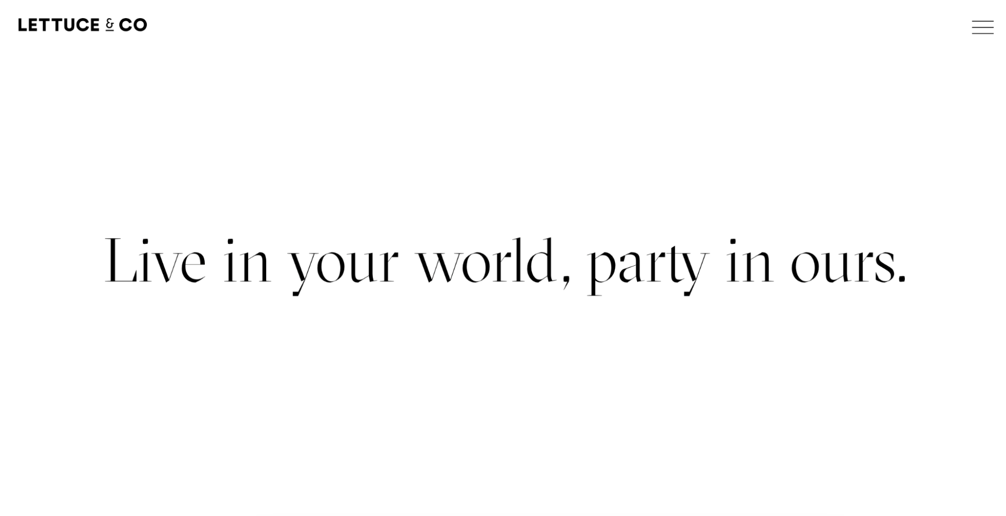
Lettuce & Co.
Lettuce & Co. is an Australian company that organizes special events. Its website takes minimalism to the next level. On a white background, it uses text to entice visitors to learn more. A simple menu graphic and the company’s logo complete the page.
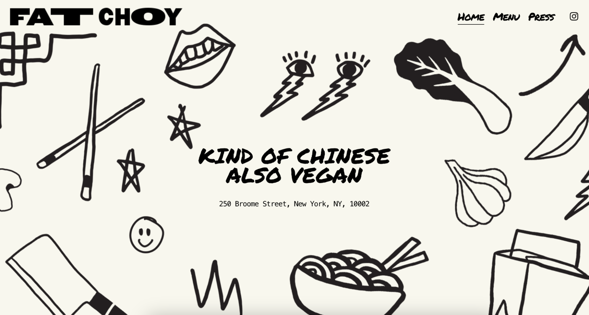
Fat Choy
Fat Choy is no longer operating, but its website is still up and offers a great option for fun, modern websites. On an off-white background, pen-and-ink-style illustrations showcase the brand; all centered around text that provides a description of the food (Vegan Chinese) and the address. Rather than tons of text, the focus on the illustrations makes this a good example of a more offbeat modern website.
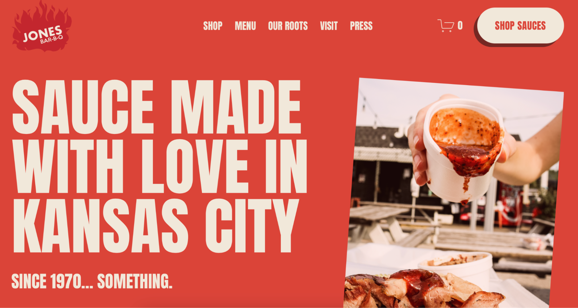
Jones Bar-B-Q
Jones Bar-B-Q is a Kansas City restaurant that also sells barbeque sauce online. Its website uses red to evoke an idea of fire, BBQ, and tangy red sauce. A photo of the famed sauce being poured is positioned at an angle along one side, while bold white text proclaims exactly what they are selling. The effective use of color and font makes this website truly pop.
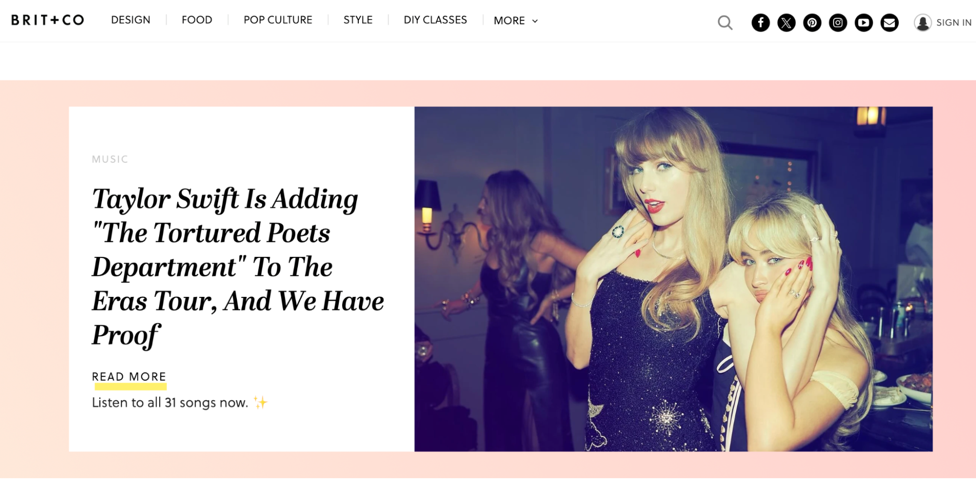
Brit + Co.
Brit + Co. is a media company that offers news and information in a clean, uncluttered way. Many media and entertainment sites are “busy” - making it hard to know where to look. This site uses cards to keep information organized and separated visually.
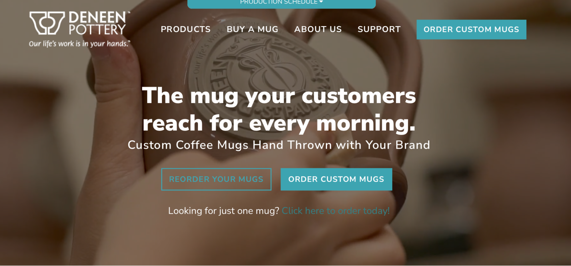
Deneen Pottery
Deneen Pottery is a pottery store that sells mugs and related pottery. Its website features a video playing across the entire home screen in the background, while simple copy urges visitors to click through. It has minimal text to keep the focus on the engaging video of the pottery-making process in the background.

Allbirds
Allbirds is known for its high-quality, comfortable shoes. Its website does a great job of incorporating a modern aesthetic into the pictures that are featured on each page. Photos of models wearing the shoes are shot against monochromatic and simple backgrounds. Minimal copy and crisp typography complete the look and make it easy to navigate the site.

Minna
Minna sells canned tea in a variety of flavors. Its website offers a great example of modern design with some fun elements. It includes a full-size photo of its products as a background, a parallax scrolling effect, and a fun use of colors.
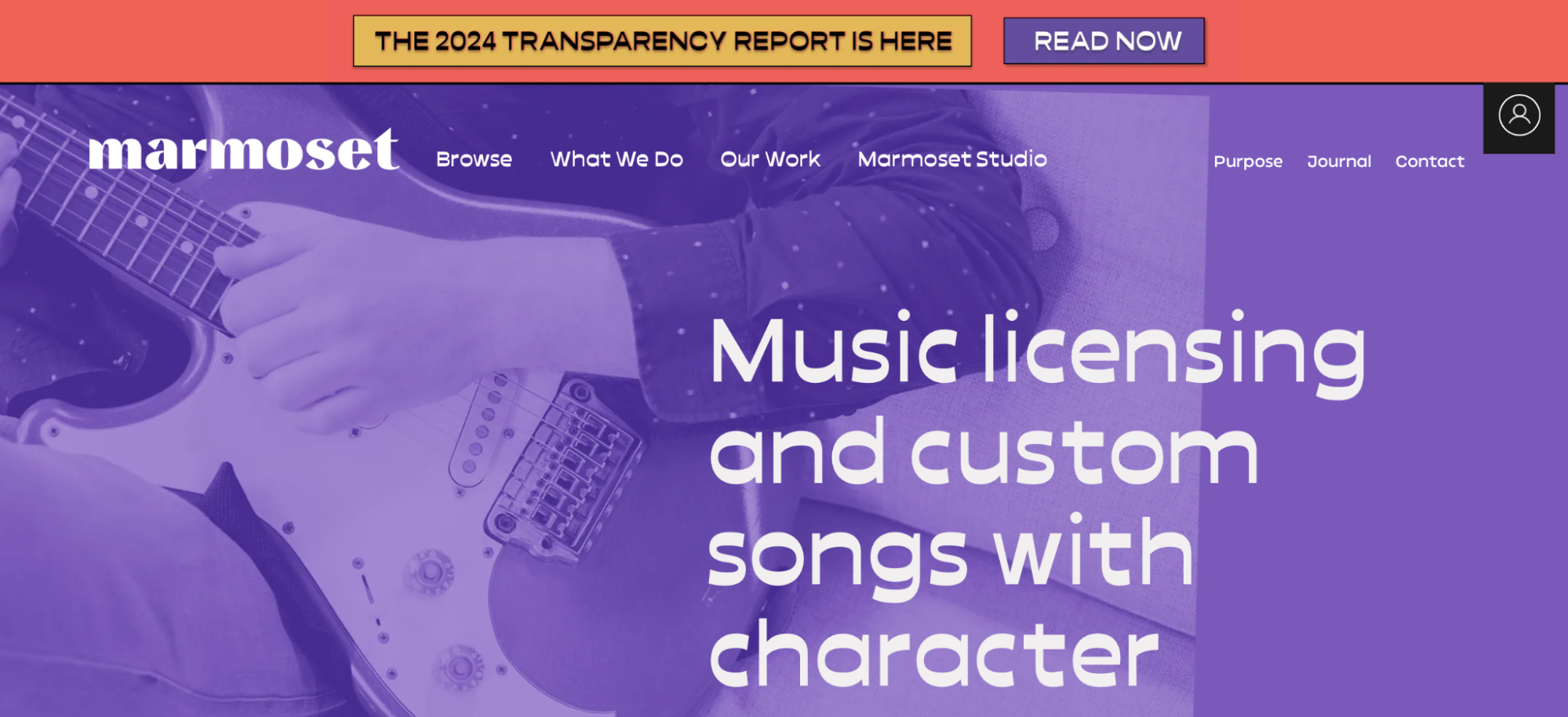
Marmoset
Marmoset is a music website that offers both licensing and custom songs. Its website makes excellent use of both color and font, with a purple wash over a background photo, bold white text, and a contrasting header in an orangey-pink color. Photos of albums and musicians pop up as you scroll down the page, keeping the website clean and fun.
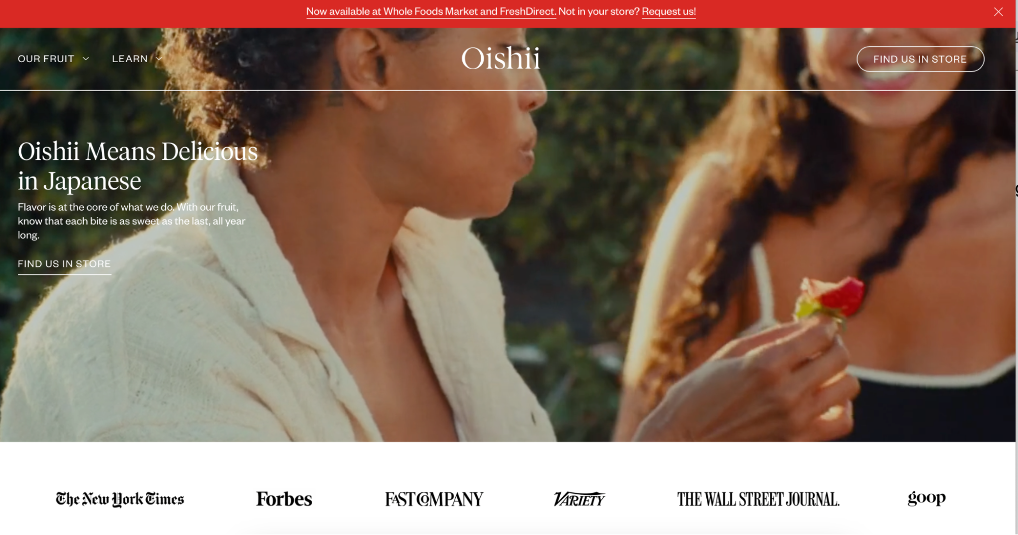
Oishii
Oishii is a Japanese company that sells high-quality produce, including omakase berries. Its website puts the focus on its product with a modern design. The main page features a full-size background video that showcases its berries. Minimal copy overlays the video, explaining that its name means delicious in Japanese - complete with a link to where these berries can be found in stores in the United States. It uses a simple red, black, and white color scheme reminiscent of its products.
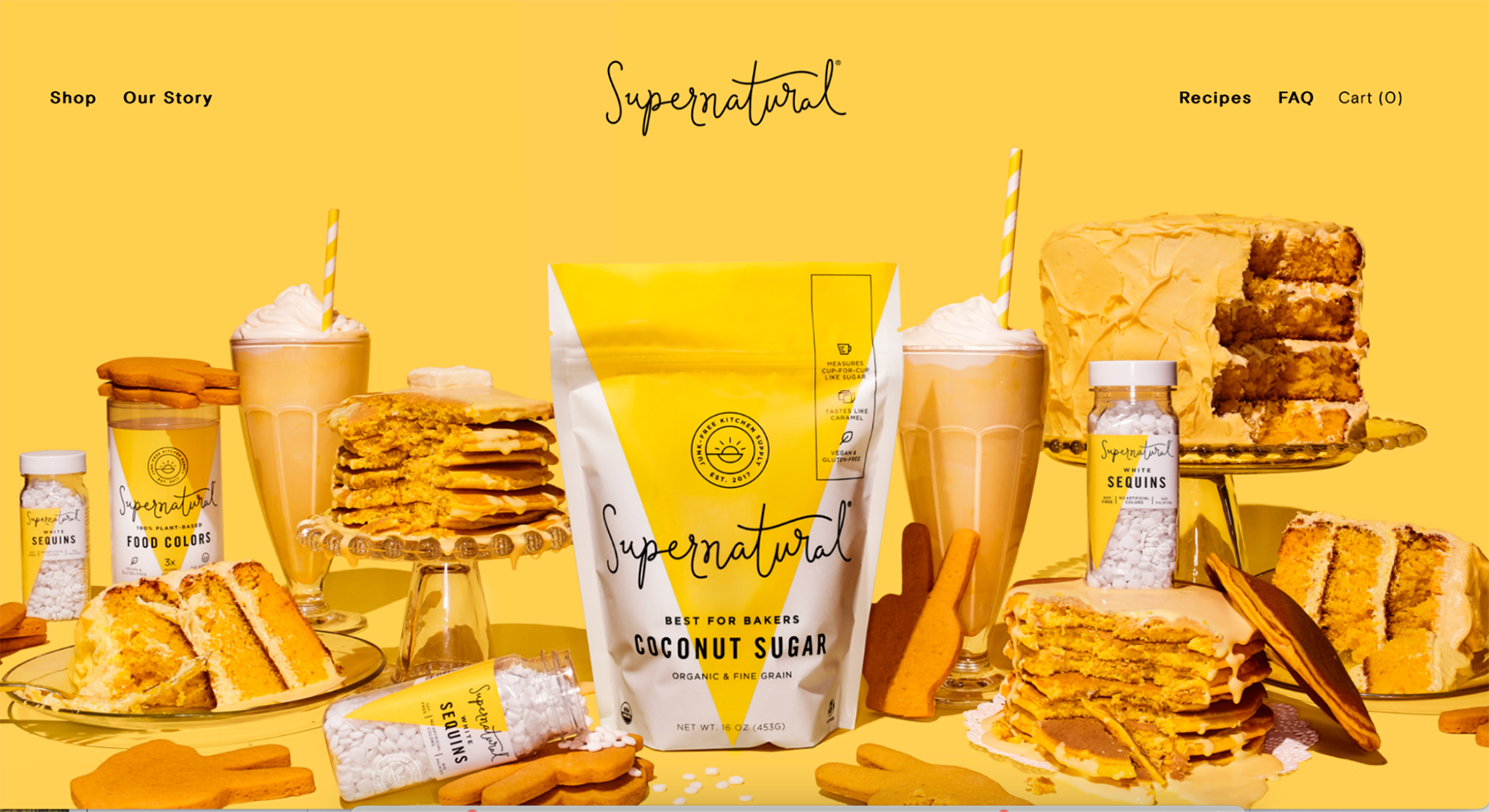
Supernatural
Supernatural is a plant-based natural food company. Its website lets its products take center stage. An array of products and foods are arranged on a yellow background that compliments the yellow, white, and black Supernatural food packaging. Minimal text completes the clean, modern look.
Moscot
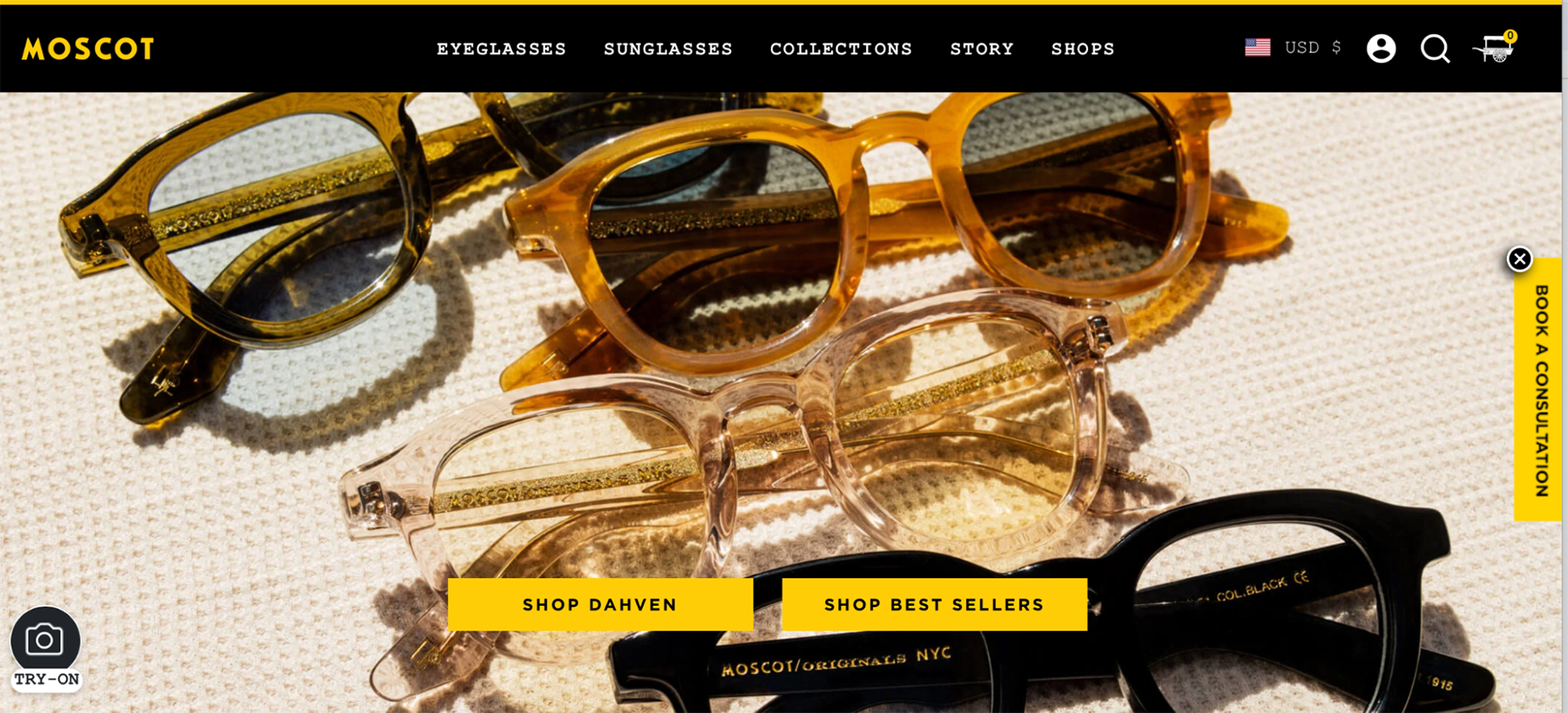
Moscot sells funky eyeglasses and sunglasses. Its website follows a somewhat familiar pattern for e-commerce sites: a bold, clean photo of its products dominates the home page. A few buttons overlay the photo to lead visitors to products, while a simple navigation bar lines the top of the page.

TobeHonest
ToBeHonest is a mental health company that is designed for students. Visitors will notice the main features swoop in as the page loads, with animated graphic illustrations surrounding the pictures. Combining photos with illustrations and spare text makes for a highly effective website.
Dropps
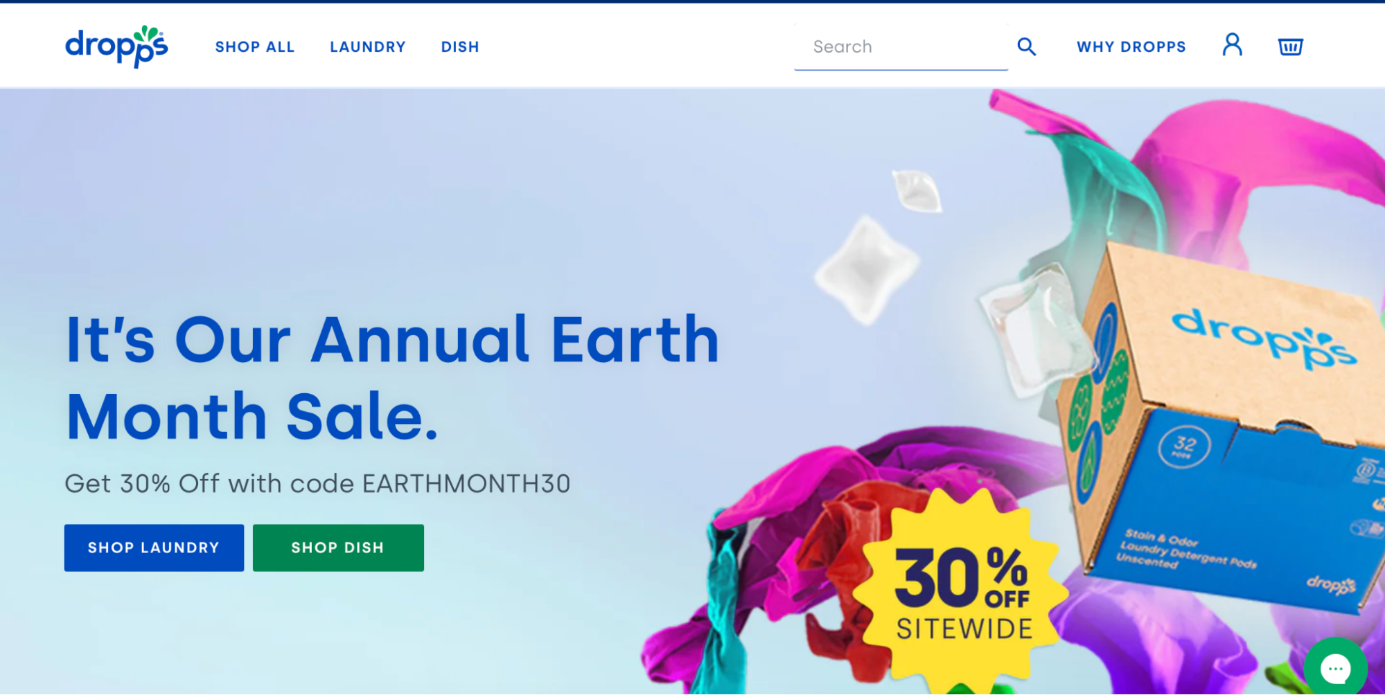
Dropps is an eco-friendly cleaning product company. Its website uses a typical template for a modern e-commerce site. Its products are featured on a full-size background image, with copy announcing the latest news. Rather than having tons of options along the navigation bar, there are just a few options that help customers get to exactly where they want to go.

The House Of
The House Of is a creative agency with a minimalistic website. Its highly stylized logo appears on the off-white background, with no words or information other than the company name and logo. Visitors can navigate the site by “opening” the door at the top right of the screen. While this style wouldn’t work for every business, it is a fun way for this type of firm to show off its design chops.
Avery Cox Design
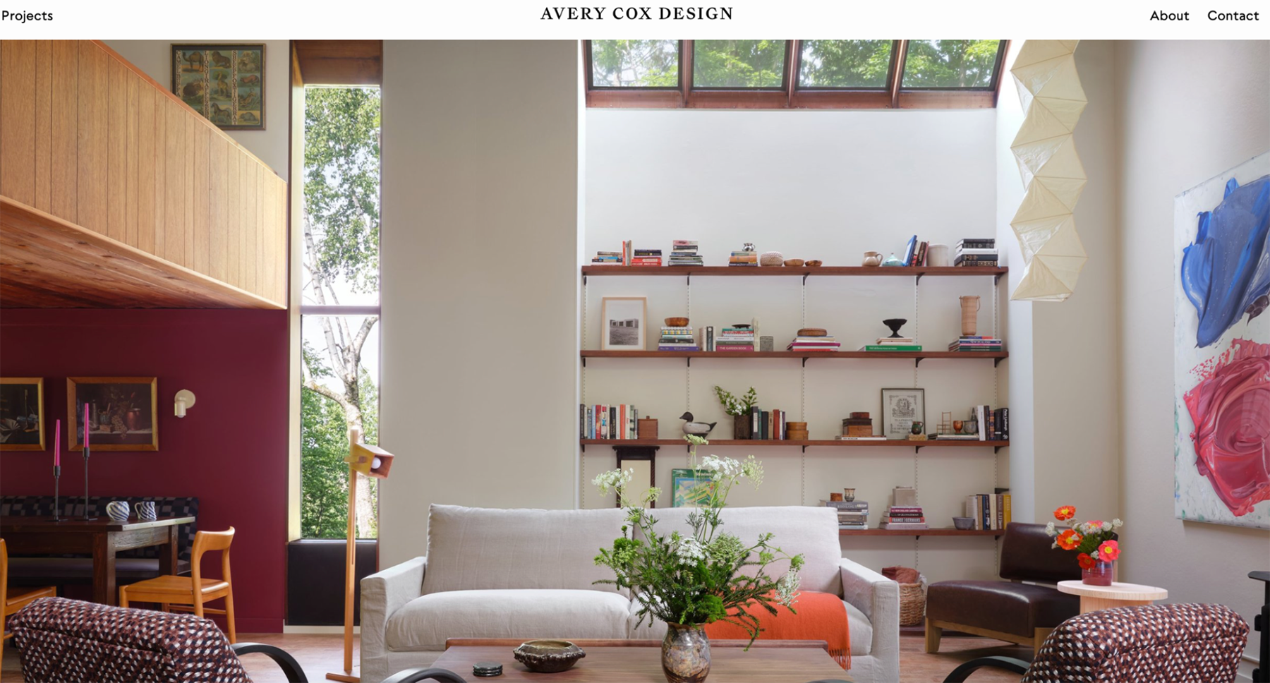
Avery Cox Design is an interior design firm. Perhaps unsurprisingly, its website is as beautiful as its projects. Almost the entire home page is taken up by a photo of one of its projects. Minimal text along the top includes a link to projects, the brand name, an about link, and a contact link. As you scroll down, a short explanation about the firm pops up alongside photographs of projects.
Sasaki
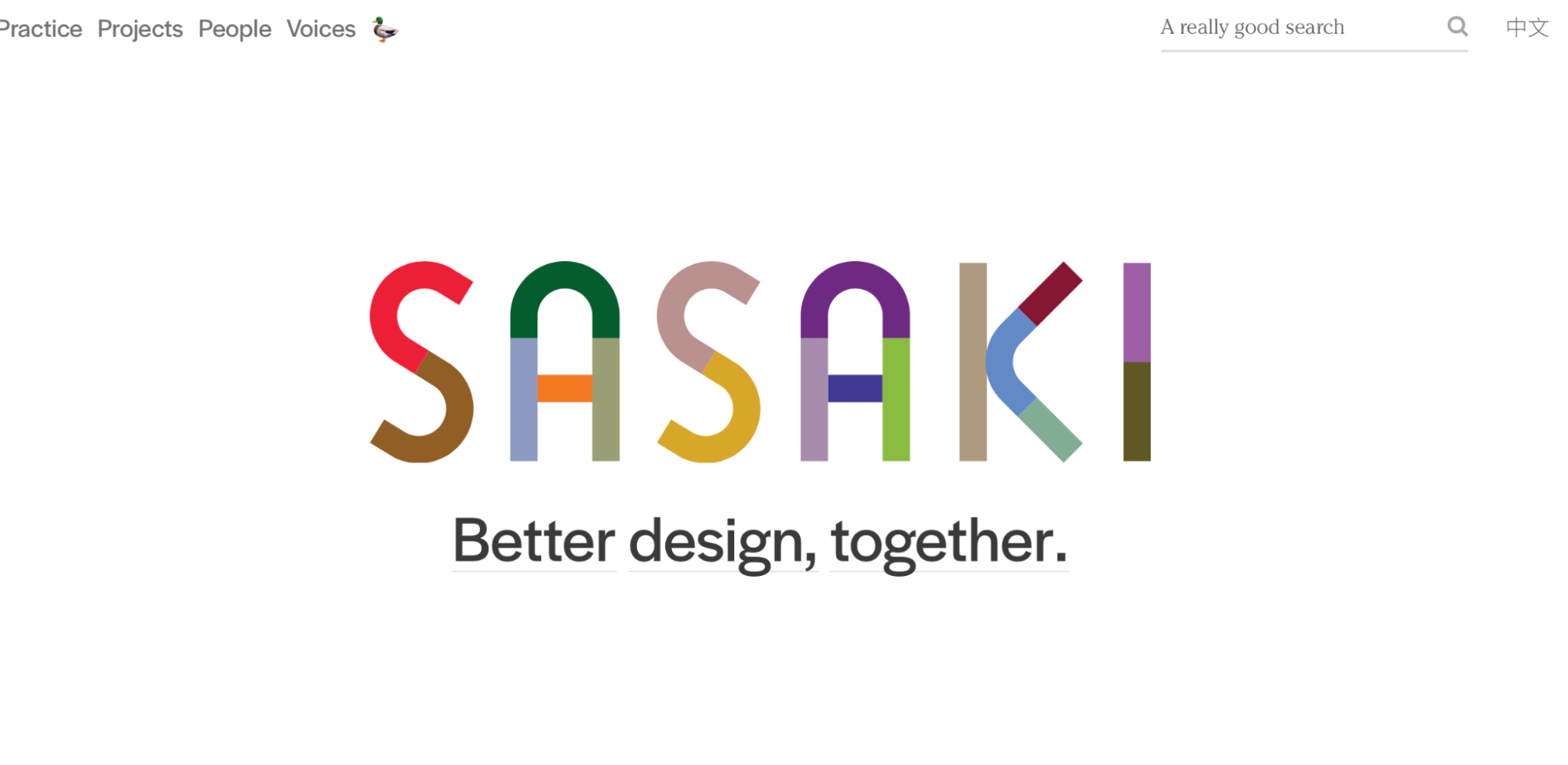
Sasaki is a design company that offers architecture, interior design, and related services. Its website is a tribute to fun, modern, clean design. Visitors to the homepage see colors swirling in the company name, centered on a white background. Throughout the website, simple animations pair with clean text and sharp photos to create a truly beautiful, unique website.
Feastables
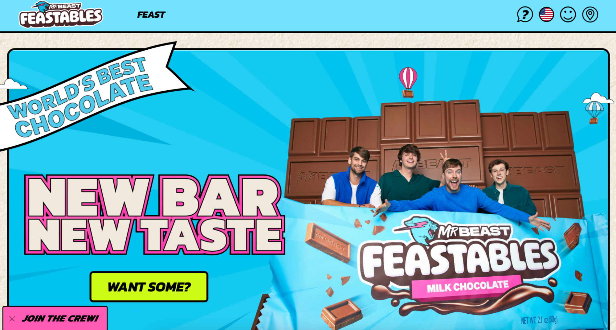
Feastables is a chocolate candy company that was created by YouTuber Mr. Beast. Its website uses the MrBeast color scheme of blue and pink. It features a fun illustrated background and navigation buttons, with an image of the MrBeast crew and the chocolate bar popping out from the background.
Devon Stank
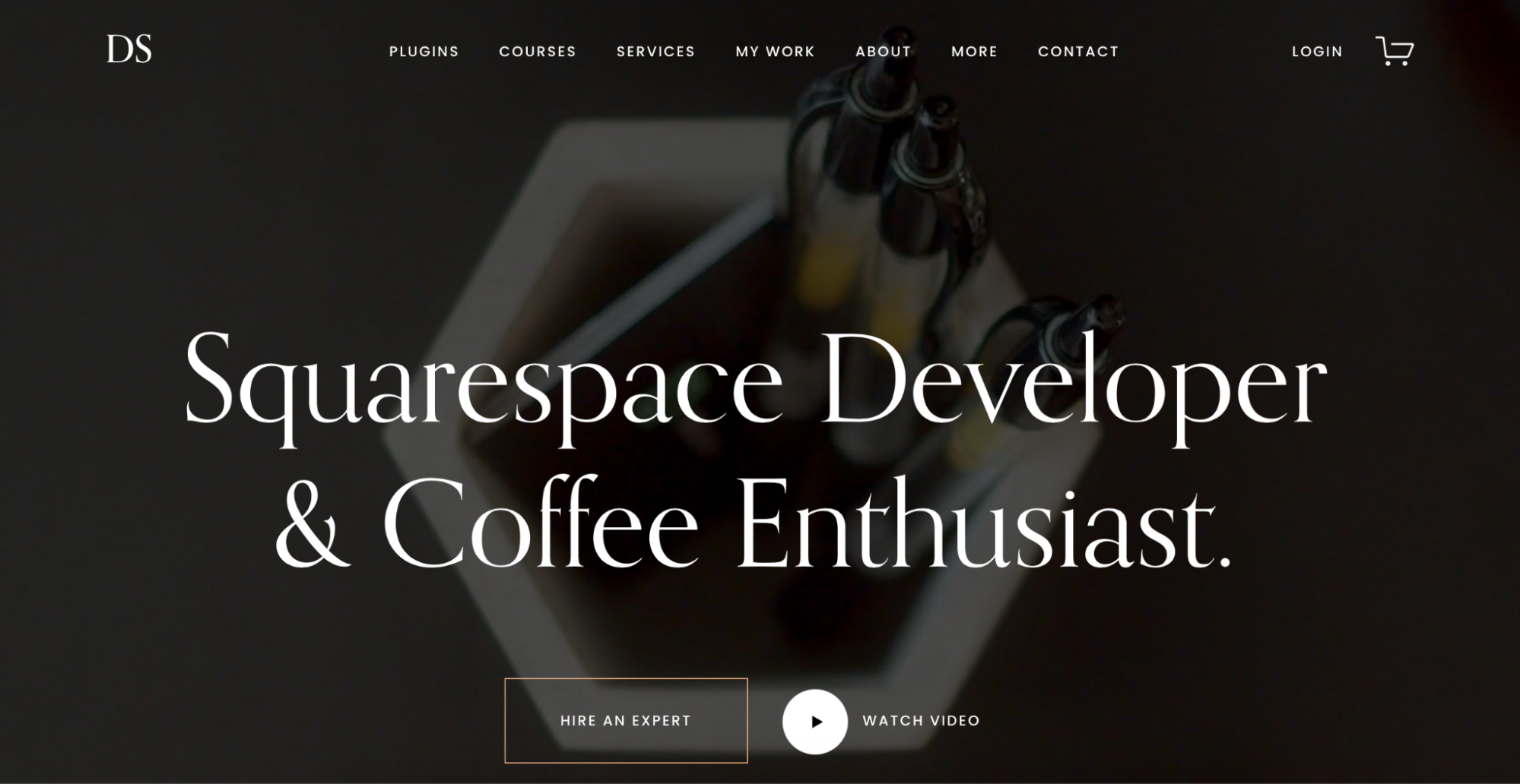
Devon Stank is a Squarespace designer who has built a personal brand, offering both design help for Squarespace sites as well as classes on building a personal brand. His website is very spare and modern, featuring a black background with a picture faded out in the back. White text overlays the picture and provides navigation options along the top of the screen.

Thursday Boot Co.
Thursday Boot Co. sells stylish, durable boots for both men and women. Its website is incredibly clean, with a hero background featuring Thursday boots worn in nature. This lack of visual clutter puts the spotlight on the boots. Minimal text points visitors to page navigation, making it easy to get around the site and find what you want to buy.
MoMa
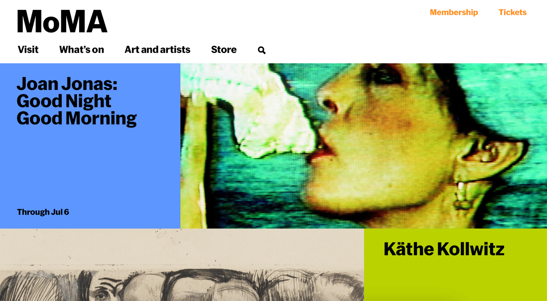
It isn’t surprising that MoMa, or the Museum of Modern Art, has a modern website. This museum is dedicated to all things modern - so it only makes sense that its website reflects that aesthetic. Blocks on the homepage feature current exhibits, while the museum’s logo and a brief navigation bar are positioned in the header.
Lin-Manuel Miranda
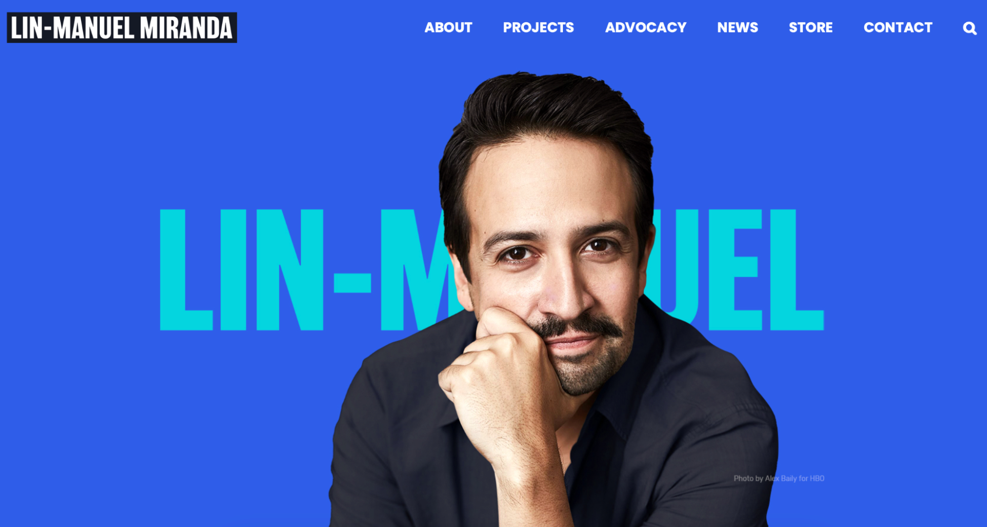
If you’re into musical theater or Disney movies, then you are probably familiar with Lin-Manuel Miranda, the creator of Hamilton and Encanto. The award-winning creator is a wonderful example of how a website can be designed to truly highlight a brand or person. It features a solid blue background and a large picture of Lin-Manuel over text that states his name. Users can find more information about him and his products or buy products.
Build a Stylish, Modern Website with Inclind
While a modern website isn’t the best choice for every business or organization, it is often a great option. An uncluttered website can help people find what they need easily - and it looks beautiful to boot. Working with Inclind can help you get the website of your dreams, including a stylish, modern site.
At Inclind, our design and development team collaborates to provide the highest quality services to businesses, healthcare organizations, membership organizations, nonprofits, and other entities. We work together to help our clients create a website that reflects them and their brand and functions exactly as they need and want it to for their business. Our services include website design and redesign, conversion optimization, automation, custom integrations, accessibility audits, and support and maintenance. We bring technical expertise, a creative mindset, and a devotion to our clients to each project.
We are here to talk if you want to explore modern website design options. Fill out our online contact form or hit the live chat button to chat with one of our team members about your website.
{
"jsonapi": {
"version": "1.0",
"meta": {
"links": {
"self": {
"href": "http:\/\/jsonapi.org\/format\/1.0\/"
}
}
}
},
"data": {
"type": "node--article",
"id": "6a350313-d25a-44ab-8a42-d626ed48e96d",
"links": {
"self": {
"href": "https:\/\/backend.inclind.com\/jsonapi\/articles\/6a350313-d25a-44ab-8a42-d626ed48e96d?resourceVersion=id%3A566"
}
},
"attributes": {
"internalId": 564,
"isPublished": true,
"title": "The 21 Best Modern Website Designs",
"created": "2024-05-02T18:06:34+00:00",
"changed": "2024-06-10T19:29:01+00:00",
"promote": false,
"sticky": false,
"metatag": [
{
"tag": "meta",
"attributes": {
"name": "title",
"content": "The 21 Best Modern Website Designs | Find Inspiration"
}
},
{
"tag": "meta",
"attributes": {
"name": "description",
"content": "When you think of modern design, you might picture something from Architectural Digest with stark lines and few decorations. You might not want to live in a"
}
},
{
"tag": "meta",
"attributes": {
"name": "abstract",
"content": "Delaware Drupal web development company specializing in custom Drupal development, real estate and rental brokerage websites, internet marketing and ecommerce"
}
},
{
"tag": "link",
"attributes": {
"rel": "canonical",
"href": "https:\/\/www.inclind.com\/news\/21-best-modern-website-designs"
}
},
{
"tag": "meta",
"attributes": {
"name": "robots",
"content": "index, follow"
}
},
{
"tag": "meta",
"attributes": {
"property": "og:site_name",
"content": "Inclind"
}
},
{
"tag": "meta",
"attributes": {
"property": "og:url",
"content": "https:\/\/www.inclind.com\/news\/21-best-modern-website-designs"
}
},
{
"tag": "meta",
"attributes": {
"property": "og:title",
"content": "The 21 Best Modern Website Designs"
}
},
{
"tag": "meta",
"attributes": {
"property": "og:description",
"content": "Delaware Drupal web development company specializing in custom Drupal development, real estate and rental brokerage websites, internet marketing and ecommerce"
}
},
{
"tag": "meta",
"attributes": {
"property": "place:location:latitude",
"content": "38.77513"
}
},
{
"tag": "meta",
"attributes": {
"property": "place:location:longitude",
"content": "-75.13974"
}
},
{
"tag": "meta",
"attributes": {
"property": "og:street_address",
"content": "119 W. Third St., Suite 6"
}
},
{
"tag": "meta",
"attributes": {
"property": "og:locality",
"content": "Lewes"
}
},
{
"tag": "meta",
"attributes": {
"property": "og:region",
"content": "Delaware"
}
},
{
"tag": "meta",
"attributes": {
"property": "og:postal_code",
"content": "19958"
}
},
{
"tag": "meta",
"attributes": {
"property": "og:country_name",
"content": "United States"
}
},
{
"tag": "meta",
"attributes": {
"property": "og:email",
"content": "hello@inclind.com"
}
},
{
"tag": "meta",
"attributes": {
"property": "og:phone_number",
"content": "(800) 604-8139"
}
}
],
"path": {
"alias": "\/news\/21-best-modern-website-designs",
"pid": 1576,
"langcode": "en"
},
"body": {
"value": "\u003Cp\u003EWhen you think of modern design, you might picture something from Architectural Digest with stark lines and few decorations. You might not want to live in a home like that, but when it comes to websites, modern design can be fabulous. It offers a stylish, effective way to convey information without overloading visitors.\u003C\/p\u003E\u003Cp\u003EModern websites run the gamut from pages with nothing more than a business\u2019 animated logo to a more traditional e-commerce site with modern elements like a full-size background photo of the products. At its core, modern design is about a more minimal approach, with effective use of white space, crisp fonts, and bold use of color. We have put together a collection of some of the best modern website designs to show a full range of options when it comes to your own website design.\u0026nbsp;\u003C\/p\u003E\u003Cp\u003EFrom our offices in Delaware, Inclind offers \u003Ca href=\u0022\/services\/custom-web-development\u0022\u003Ewebsite development\u003C\/a\u003E, \u003Ca href=\u0022\/services\/custom-web-design\u0022\u003Edesign\u003C\/a\u003E, \u003Ca href=\u0022\/support\u0022\u003Emaintenance and support\u003C\/a\u003E services to clients throughout the United States. We work with all types of organizations, including nonprofits, member associations, and corporations. Our goal is to help our clients build a website that meets their branding aesthetic and offers all the functionality they want and need. If you\u2019re interested in learning more, reach out to us to speak with a member of our team.\u0026nbsp;\u003C\/p\u003E\u003Ch2\u003E21 Examples of Great Modern Website Designs\u0026nbsp;\u003C\/h2\u003E\u003Cp\u003EWhat makes a modern website? The answer probably depends on who you ask. However, there are some common elements that unite most modern websites.\u0026nbsp;\u003C\/p\u003E\u003Cp\u003EModern sites tend to be more minimal and never cluttered. They often make effective use of white space. They rarely have a lot of copy, often using photos, videos, and illustrations to get their point across. These websites also tend to use more clean typography and focus on a simple color scheme.\u0026nbsp;\u003C\/p\u003E\u003Cp\u003EIf you are looking for inspiration for your modern website, we have collected some great examples. Each offers a slightly different take on a modern website to show you that there is no one right way to make this type of site.\u0026nbsp;\u003C\/p\u003E\u003Cp\u003E\u003Cimg style=\u0022height:auto;width:100%;\u0022 src=\u0022https:\/\/backend.inclind.com\/sites\/default\/files\/media\/images\/2024-05\/image6.png\u0022\u003E\u003C\/p\u003E\u003Ch3\u003ELettuce \u0026amp; Co.\u0026nbsp;\u003C\/h3\u003E\u003Cp\u003E\u003Ca href=\u0022https:\/\/lettuceandco.com.au\/\u0022 target=\u0022_blank\u0022\u003ELettuce \u0026amp; Co.\u003C\/a\u003E is an Australian company that organizes special events. Its website takes minimalism to the next level. On a white background, it uses text to entice visitors to learn more. A simple menu graphic and the company\u2019s logo complete the page.\u0026nbsp;\u003C\/p\u003E\u003Cp\u003E\u003Cimg style=\u0022height:auto;width:100%;\u0022 src=\u0022https:\/\/backend.inclind.com\/sites\/default\/files\/media\/images\/2024-05\/image12.png\u0022\u003E\u003C\/p\u003E\u003Ch3\u003EFat Choy\u0026nbsp;\u003C\/h3\u003E\u003Cp\u003E\u003Ca href=\u0022https:\/\/www.fatchoynyc.com\/\u0022 target=\u0022_blank\u0022\u003EFat Choy\u003C\/a\u003E is no longer operating, but its website is still up and offers a great option for fun, modern websites. On an off-white background, pen-and-ink-style illustrations showcase the brand; all centered around text that provides a description of the food (Vegan Chinese) and the address. Rather than tons of text, the focus on the illustrations makes this a good example of a more offbeat modern website.\u0026nbsp;\u003C\/p\u003E\u003Cp\u003E\u003Cimg style=\u0022height:auto;width:100%;\u0022 src=\u0022https:\/\/backend.inclind.com\/sites\/default\/files\/media\/images\/2024-05\/image21.png\u0022\u003E\u003C\/p\u003E\u003Ch3\u003EJones Bar-B-Q\u0026nbsp;\u003C\/h3\u003E\u003Cp\u003E\u003Ca href=\u0022https:\/\/www.jonesbbqkc.com\/\u0022 target=\u0022_blank\u0022\u003EJones Bar-B-Q\u003C\/a\u003E is a Kansas City restaurant that also sells barbeque sauce online. Its website uses red to evoke an idea of fire, BBQ, and tangy red sauce. A photo of the famed sauce being poured is positioned at an angle along one side, while bold white text proclaims exactly what they are selling. The effective use of color and font makes this website truly pop.\u0026nbsp;\u003C\/p\u003E\u003Cp\u003E\u003Cimg style=\u0022height:auto;width:100%;\u0022 src=\u0022https:\/\/backend.inclind.com\/sites\/default\/files\/media\/images\/2024-05\/image15.png\u0022\u003E\u003C\/p\u003E\u003Ch3\u003EBrit + Co.\u0026nbsp;\u003C\/h3\u003E\u003Cp\u003E\u003Ca href=\u0022https:\/\/www.brit.co\/\u0022 target=\u0022_blank\u0022\u003EBrit + Co.\u003C\/a\u003E is a media company that offers news and information in a clean, uncluttered way. Many media and entertainment sites are \u201cbusy\u201d - making it hard to know where to look. This site uses cards to keep information organized and separated visually.\u0026nbsp;\u003C\/p\u003E\u003Cp\u003E\u003Cimg style=\u0022height:auto;width:100%;\u0022 src=\u0022https:\/\/backend.inclind.com\/sites\/default\/files\/media\/images\/2024-05\/image8.png\u0022\u003E\u003C\/p\u003E\u003Ch3\u003EDeneen Pottery\u0026nbsp;\u003C\/h3\u003E\u003Cp\u003E\u003Ca href=\u0022https:\/\/deneenpottery.com\/\u0022 target=\u0022_blank\u0022\u003EDeneen Pottery\u003C\/a\u003E is a pottery store that sells mugs and related pottery. Its website features a video playing across the entire home screen in the background, while simple copy urges visitors to click through. It has minimal text to keep the focus on the engaging video of the pottery-making process in the background.\u0026nbsp;\u003C\/p\u003E\u003Cp\u003E\u003Cimg style=\u0022height:auto;width:100%;\u0022 src=\u0022https:\/\/backend.inclind.com\/sites\/default\/files\/media\/images\/2024-05\/image22.png\u0022\u003E\u003C\/p\u003E\u003Ch3\u003EAllbirds\u0026nbsp;\u003C\/h3\u003E\u003Cp\u003E\u003Ca href=\u0022https:\/\/www.allbirds.com\/\u0022 target=\u0022_blank\u0022\u003EAllbirds\u003C\/a\u003E is known for its high-quality, comfortable shoes. Its website does a great job of incorporating a modern aesthetic into the pictures that are featured on each page. Photos of models wearing the shoes are shot against monochromatic and simple backgrounds. Minimal copy and crisp typography complete the look and make it easy to navigate the site.\u0026nbsp;\u003C\/p\u003E\u003Cp\u003E\u003Cimg style=\u0022height:auto;width:100%;\u0022 src=\u0022https:\/\/backend.inclind.com\/sites\/default\/files\/media\/images\/2024-05\/image13.png\u0022\u003E\u003C\/p\u003E\u003Ch3\u003EMinna\u0026nbsp;\u003C\/h3\u003E\u003Cp\u003E\u003Ca href=\u0022https:\/\/www.drinkminna.com\/\u0022 target=\u0022_blank\u0022\u003EMinna\u003C\/a\u003E sells canned tea in a variety of flavors. Its website offers a great example of modern design with some fun elements. It includes a full-size photo of its products as a background, a parallax scrolling effect, and a fun use of colors.\u0026nbsp;\u003C\/p\u003E\u003Cp\u003E\u003Cimg style=\u0022height:auto;width:100%;\u0022 src=\u0022https:\/\/backend.inclind.com\/sites\/default\/files\/media\/images\/2024-05\/image19.png\u0022\u003E\u003C\/p\u003E\u003Ch3\u003EMarmoset\u0026nbsp;\u003C\/h3\u003E\u003Cp\u003E\u003Ca href=\u0022https:\/\/www.marmosetmusic.com\/\u0022 target=\u0022_blank\u0022\u003EMarmoset\u003C\/a\u003E is a music website that offers both licensing and custom songs. Its website makes excellent use of both color and font, with a purple wash over a background photo, bold white text, and a contrasting header in an orangey-pink color. Photos of albums and musicians pop up as you scroll down the page, keeping the website clean and fun.\u0026nbsp;\u003C\/p\u003E\u003Cp\u003E\u003Cimg style=\u0022height:auto;width:100%;\u0022 src=\u0022https:\/\/backend.inclind.com\/sites\/default\/files\/media\/images\/2024-05\/image10.png\u0022\u003E\u003C\/p\u003E\u003Ch3\u003EOishii\u0026nbsp;\u003C\/h3\u003E\u003Cp\u003E\u003Ca href=\u0022https:\/\/oishii.com\/\u0022 target=\u0022_blank\u0022\u003EOishii\u003C\/a\u003E is a Japanese company that sells high-quality produce, including omakase berries. Its website puts the focus on its product with a modern design. The main page features a full-size background video that showcases its berries. Minimal copy overlays the video, explaining that its name means delicious in Japanese - complete with a link to where these berries can be found in stores in the United States. It uses a simple red, black, and white color scheme reminiscent of its products.\u0026nbsp;\u003C\/p\u003E\u003Cp\u003E\u003Cimg style=\u0022height:auto;width:100%;\u0022 src=\u0022https:\/\/backend.inclind.com\/sites\/default\/files\/media\/images\/2024-05\/image17.png\u0022\u003E\u003C\/p\u003E\u003Ch3\u003ESupernatural\u0026nbsp;\u003C\/h3\u003E\u003Cp\u003E\u003Ca href=\u0022https:\/\/www.supernaturalkitchen.com\/\u0022 target=\u0022_blank\u0022\u003ESupernatural\u003C\/a\u003E is a plant-based natural food company. Its website lets its products take center stage. An array of products and foods are arranged on a yellow background that compliments the yellow, white, and black Supernatural food packaging. Minimal text completes the clean, modern look.\u0026nbsp;\u003C\/p\u003E\u003Cp\u003E\u003Cimg style=\u0022height:auto;width:100%;\u0022 src=\u0022https:\/\/backend.inclind.com\/sites\/default\/files\/media\/images\/2024-05\/image3.png\u0022\u003E\u003C\/p\u003E\u003Ch3\u003EMoscot\u0026nbsp;\u003C\/h3\u003E\u003Cp\u003E\u003Ca href=\u0022https:\/\/moscot.com\/\u0022 target=\u0022_blank\u0022\u003EMoscot\u003C\/a\u003E sells funky eyeglasses and sunglasses. Its website follows a somewhat familiar pattern for e-commerce sites: a bold, clean photo of its products dominates the home page. A few buttons overlay the photo to lead visitors to products, while a simple navigation bar lines the top of the page.\u0026nbsp;\u003C\/p\u003E\u003Cp\u003E\u003Cimg style=\u0022height:auto;width:100%;\u0022 src=\u0022https:\/\/backend.inclind.com\/sites\/default\/files\/media\/images\/2024-05\/image16.png\u0022\u003E\u003C\/p\u003E\u003Ch3\u003ETobeHonest\u0026nbsp;\u003C\/h3\u003E\u003Cp\u003E\u003Ca href=\u0022https:\/\/tbh.studiovoila.com\/\u0022 target=\u0022_blank\u0022\u003EToBeHonest\u003C\/a\u003E is a mental health company that is designed for students. Visitors will notice the main features swoop in as the page loads, with animated graphic illustrations surrounding the pictures. Combining photos with illustrations and spare text makes for a highly effective website.\u0026nbsp;\u003C\/p\u003E\u003Cp\u003E\u003Cimg style=\u0022height:auto;width:100%;\u0022 src=\u0022https:\/\/backend.inclind.com\/sites\/default\/files\/media\/images\/2024-05\/image4.png\u0022\u003E\u003C\/p\u003E\u003Ch3\u003EDropps\u0026nbsp;\u003C\/h3\u003E\u003Cp\u003E\u003Ca href=\u0022https:\/\/www.dropps.com\/\u0022 target=\u0022_blank\u0022\u003EDropps\u003C\/a\u003E is an eco-friendly cleaning product company. Its website uses a typical template for a modern e-commerce site. Its products are featured on a full-size background image, with copy announcing the latest news. Rather than having tons of options along the navigation bar, there are just a few options that help customers get to exactly where they want to go.\u0026nbsp;\u003C\/p\u003E\u003Cp\u003E\u003Cimg style=\u0022height:auto;width:100%;\u0022 src=\u0022https:\/\/backend.inclind.com\/sites\/default\/files\/media\/images\/2024-05\/image9.png\u0022\u003E\u003C\/p\u003E\u003Ch3\u003EThe House Of\u0026nbsp;\u003C\/h3\u003E\u003Cp\u003E\u003Ca href=\u0022https:\/\/www.thoagency.com\/\u0022 target=\u0022_blank\u0022\u003EThe House Of\u003C\/a\u003E is a creative agency with a minimalistic website. Its highly stylized logo appears on the off-white background, with no words or information other than the company name and logo. Visitors can navigate the site by \u201copening\u201d the door at the top right of the screen. While this style wouldn\u2019t work for every business, it is a fun way for this type of firm to show off its design chops.\u0026nbsp;\u003C\/p\u003E\u003Cp\u003E\u003Cimg style=\u0022height:auto;width:100%;\u0022 src=\u0022https:\/\/backend.inclind.com\/sites\/default\/files\/media\/images\/2024-05\/image14.png\u0022\u003E\u003C\/p\u003E\u003Ch3\u003EAvery Cox Design\u0026nbsp;\u003C\/h3\u003E\u003Cp\u003E\u003Ca href=\u0022https:\/\/www.averycoxdesign.com\/\u0022 target=\u0022_blank\u0022\u003EAvery Cox Design\u003C\/a\u003E is an interior design firm. Perhaps unsurprisingly, its website is as beautiful as its projects. Almost the entire home page is taken up by a photo of one of its projects. Minimal text along the top includes a link to projects, the brand name, an about link, and a contact link. As you scroll down, a short explanation about the firm pops up alongside photographs of projects.\u0026nbsp;\u003C\/p\u003E\u003Cp\u003E\u003Cimg style=\u0022height:auto;width:100%;\u0022 src=\u0022https:\/\/backend.inclind.com\/sites\/default\/files\/media\/images\/2024-05\/image7.png\u0022\u003E\u003C\/p\u003E\u003Ch3\u003ESasaki\u0026nbsp;\u003C\/h3\u003E\u003Cp\u003E\u003Ca href=\u0022https:\/\/www.sasaki.com\/\u0022 target=\u0022_blank\u0022\u003ESasaki\u003C\/a\u003E is a design company that offers architecture, interior design, and related services. Its website is a tribute to fun, modern, clean design. Visitors to the homepage see colors swirling in the company name, centered on a white background. Throughout the website, simple animations pair with clean text and sharp photos to create a truly beautiful, unique website.\u0026nbsp;\u003C\/p\u003E\u003Cp\u003E\u003Cimg style=\u0022height:auto;width:100%;\u0022 src=\u0022https:\/\/backend.inclind.com\/sites\/default\/files\/\/media\/images\/2024-05\/image11.png\u0022\u003E\u003C\/p\u003E\u003Ch3\u003EFeastables\u0026nbsp;\u003C\/h3\u003E\u003Cp\u003E\u003Ca href=\u0022https:\/\/feastables.com\/\u0022 target=\u0022_blank\u0022\u003EFeastables\u003C\/a\u003E is a chocolate candy company that was created by YouTuber Mr. Beast. Its website uses the MrBeast color scheme of blue and pink. It features a fun illustrated background and navigation buttons, with an image of the MrBeast crew and the chocolate bar popping out from the background.\u0026nbsp;\u003C\/p\u003E\u003Cp\u003E\u003Cimg style=\u0022height:auto;width:100%;\u0022 src=\u0022https:\/\/backend.inclind.com\/sites\/default\/files\/media\/images\/2024-05\/image1.png\u0022\u003E\u003C\/p\u003E\u003Ch3\u003EDevon Stank\u0026nbsp;\u003C\/h3\u003E\u003Cp\u003E\u003Ca href=\u0022https:\/\/devonstank.com\/\u0022 target=\u0022_blank\u0022\u003EDevon Stank\u003C\/a\u003E is a Squarespace designer who has built a personal brand, offering both design help for Squarespace sites as well as classes on building a personal brand. His website is very spare and modern, featuring a black background with a picture faded out in the back. White text overlays the picture and provides navigation options along the top of the screen.\u0026nbsp;\u003C\/p\u003E\u003Cp\u003E\u003Cimg style=\u0022height:auto;width:100%;\u0022 src=\u0022https:\/\/backend.inclind.com\/sites\/default\/files\/media\/images\/2024-05\/image2.png\u0022\u003E\u003C\/p\u003E\u003Ch3\u003EThursday Boot Co.\u0026nbsp;\u003C\/h3\u003E\u003Cp\u003E\u003Ca href=\u0022https:\/\/thursdayboots.com\/\u0022 target=\u0022_blank\u0022\u003EThursday Boot Co.\u003C\/a\u003E sells stylish, durable boots for both men and women. Its website is incredibly clean, with a hero background featuring Thursday boots worn in nature. This lack of visual clutter puts the spotlight on the boots. Minimal text points visitors to page navigation, making it easy to get around the site and find what you want to buy.\u0026nbsp;\u003C\/p\u003E\u003Cp\u003E\u003Cimg style=\u0022height:auto;width:100%;\u0022 src=\u0022https:\/\/backend.inclind.com\/sites\/default\/files\/media\/images\/2024-05\/image5.png\u0022\u003E\u003C\/p\u003E\u003Ch3\u003EMoMa\u0026nbsp;\u003C\/h3\u003E\u003Cp\u003EIt isn\u2019t surprising that \u003Ca href=\u0022https:\/\/www.moma.org\/\u0022 target=\u0022_blank\u0022\u003EMoMa\u003C\/a\u003E, or the Museum of Modern Art, has a modern website. This museum is dedicated to all things modern - so it only makes sense that its website reflects that aesthetic. Blocks on the homepage feature current exhibits, while the museum\u2019s logo and a brief navigation bar are positioned in the header.\u0026nbsp;\u003C\/p\u003E\u003Cp\u003E\u003Cimg style=\u0022height:auto;width:100%;\u0022 src=\u0022https:\/\/backend.inclind.com\/sites\/default\/files\/media\/images\/2024-05\/image20.png\u0022\u003E\u003C\/p\u003E\u003Ch3\u003ELin-Manuel Miranda\u0026nbsp;\u003C\/h3\u003E\u003Cp\u003EIf you\u2019re into musical theater or Disney movies, then you are probably familiar with \u003Ca href=\u0022https:\/\/www.linmanuel.com\/\u0022 target=\u0022_blank\u0022\u003ELin-Manuel Miranda\u003C\/a\u003E, the creator of Hamilton and Encanto. The award-winning creator is a wonderful example of how a website can be designed to truly highlight a brand or person. It features a solid blue background and a large picture of Lin-Manuel over text that states his name. Users can find more information about him and his products or buy products.\u0026nbsp;\u003C\/p\u003E\u003Ch2\u003EBuild a Stylish, Modern Website with Inclind\u003C\/h2\u003E\u003Cp\u003EWhile a modern website isn\u2019t the best choice for every business or organization, it is often a great option. An uncluttered website can help people find what they need easily - and it looks beautiful to boot. Working with Inclind can help you get the website of your dreams, including a stylish, modern site.\u0026nbsp;\u003C\/p\u003E\u003Cp\u003EAt Inclind, our design and development team collaborates to provide the highest quality services to businesses, healthcare organizations, membership organizations, nonprofits, and other entities. We work together to help our clients create a website that reflects them and their brand and functions exactly as they need and want it to for their business. Our services include website design and \u003Ca href=\u0022https:\/\/www.inclind.com\/solutions\/website-redesigns\u0022\u003Eredesign\u003C\/a\u003E, \u003Ca href=\u0022https:\/\/www.inclind.com\/solutions\/conversion-optimization\u0022\u003Econversion optimization\u003C\/a\u003E, automation, \u003Ca href=\u0022https:\/\/www.inclind.com\/solutions\/integrations\u0022\u003Ecustom integrations\u003C\/a\u003E, \u003Ca href=\u0022https:\/\/www.inclind.com\/solutions\/accessibility-audits\u0022\u003Eaccessibility audits\u003C\/a\u003E, and \u003Ca href=\u0022https:\/\/www.inclind.com\/support\u0022\u003Esupport and maintenance\u003C\/a\u003E. We bring technical expertise, a creative mindset, and a devotion to our clients to each project.\u0026nbsp;\u003C\/p\u003E\u003Cp\u003EWe are here to talk if you want to explore modern website design options. Fill out our \u003Ca href=\u0022https:\/\/www.inclind.com\/services#link1\u0022\u003Eonline contact form\u003C\/a\u003E or hit the live chat button to chat with one of our team members about your website.\u003C\/p\u003E",
"format": "full_html",
"processed": "\u003Cp\u003EWhen you think of modern design, you might picture something from Architectural Digest with stark lines and few decorations. You might not want to live in a home like that, but when it comes to websites, modern design can be fabulous. It offers a stylish, effective way to convey information without overloading visitors.\u003C\/p\u003E\n\u003Cp\u003EModern websites run the gamut from pages with nothing more than a business\u2019 animated logo to a more traditional e-commerce site with modern elements like a full-size background photo of the products. At its core, modern design is about a more minimal approach, with effective use of white space, crisp fonts, and bold use of color. We have put together a collection of some of the best modern website designs to show a full range of options when it comes to your own website design.\u0026nbsp;\u003C\/p\u003E\n\u003Cp\u003EFrom our offices in Delaware, Inclind offers \u003Ca href=\u0022\/services\/custom-web-development\u0022\u003Ewebsite development\u003C\/a\u003E, \u003Ca href=\u0022\/services\/custom-web-design\u0022\u003Edesign\u003C\/a\u003E, \u003Ca href=\u0022\/support\u0022\u003Emaintenance and support\u003C\/a\u003E services to clients throughout the United States. We work with all types of organizations, including nonprofits, member associations, and corporations. Our goal is to help our clients build a website that meets their branding aesthetic and offers all the functionality they want and need. If you\u2019re interested in learning more, reach out to us to speak with a member of our team.\u0026nbsp;\u003C\/p\u003E\n\u003Ch2\u003E21 Examples of Great Modern Website Designs\u0026nbsp;\u003C\/h2\u003E\n\u003Cp\u003EWhat makes a modern website? The answer probably depends on who you ask. However, there are some common elements that unite most modern websites.\u0026nbsp;\u003C\/p\u003E\n\u003Cp\u003EModern sites tend to be more minimal and never cluttered. They often make effective use of white space. They rarely have a lot of copy, often using photos, videos, and illustrations to get their point across. These websites also tend to use more clean typography and focus on a simple color scheme.\u0026nbsp;\u003C\/p\u003E\n\u003Cp\u003EIf you are looking for inspiration for your modern website, we have collected some great examples. Each offers a slightly different take on a modern website to show you that there is no one right way to make this type of site.\u0026nbsp;\u003C\/p\u003E\n\u003Cp\u003E\u003Cimg style=\u0022height:auto;width:100%;\u0022 src=\u0022https:\/\/backend.inclind.com\/sites\/default\/files\/media\/images\/2024-05\/image6.png\u0022\u003E\u003C\/p\u003E\n\u003Ch3\u003ELettuce \u0026amp; Co.\u0026nbsp;\u003C\/h3\u003E\n\u003Cp\u003E\u003Ca href=\u0022https:\/\/lettuceandco.com.au\/\u0022 target=\u0022_blank\u0022\u003ELettuce \u0026amp; Co.\u003C\/a\u003E is an Australian company that organizes special events. Its website takes minimalism to the next level. On a white background, it uses text to entice visitors to learn more. A simple menu graphic and the company\u2019s logo complete the page.\u0026nbsp;\u003C\/p\u003E\n\u003Cp\u003E\u003Cimg style=\u0022height:auto;width:100%;\u0022 src=\u0022https:\/\/backend.inclind.com\/sites\/default\/files\/media\/images\/2024-05\/image12.png\u0022\u003E\u003C\/p\u003E\n\u003Ch3\u003EFat Choy\u0026nbsp;\u003C\/h3\u003E\n\u003Cp\u003E\u003Ca href=\u0022https:\/\/www.fatchoynyc.com\/\u0022 target=\u0022_blank\u0022\u003EFat Choy\u003C\/a\u003E is no longer operating, but its website is still up and offers a great option for fun, modern websites. On an off-white background, pen-and-ink-style illustrations showcase the brand; all centered around text that provides a description of the food (Vegan Chinese) and the address. Rather than tons of text, the focus on the illustrations makes this a good example of a more offbeat modern website.\u0026nbsp;\u003C\/p\u003E\n\u003Cp\u003E\u003Cimg style=\u0022height:auto;width:100%;\u0022 src=\u0022https:\/\/backend.inclind.com\/sites\/default\/files\/media\/images\/2024-05\/image21.png\u0022\u003E\u003C\/p\u003E\n\u003Ch3\u003EJones Bar-B-Q\u0026nbsp;\u003C\/h3\u003E\n\u003Cp\u003E\u003Ca href=\u0022https:\/\/www.jonesbbqkc.com\/\u0022 target=\u0022_blank\u0022\u003EJones Bar-B-Q\u003C\/a\u003E is a Kansas City restaurant that also sells barbeque sauce online. Its website uses red to evoke an idea of fire, BBQ, and tangy red sauce. A photo of the famed sauce being poured is positioned at an angle along one side, while bold white text proclaims exactly what they are selling. The effective use of color and font makes this website truly pop.\u0026nbsp;\u003C\/p\u003E\n\u003Cp\u003E\u003Cimg style=\u0022height:auto;width:100%;\u0022 src=\u0022https:\/\/backend.inclind.com\/sites\/default\/files\/media\/images\/2024-05\/image15.png\u0022\u003E\u003C\/p\u003E\n\u003Ch3\u003EBrit + Co.\u0026nbsp;\u003C\/h3\u003E\n\u003Cp\u003E\u003Ca href=\u0022https:\/\/www.brit.co\/\u0022 target=\u0022_blank\u0022\u003EBrit + Co.\u003C\/a\u003E is a media company that offers news and information in a clean, uncluttered way. Many media and entertainment sites are \u201cbusy\u201d - making it hard to know where to look. This site uses cards to keep information organized and separated visually.\u0026nbsp;\u003C\/p\u003E\n\u003Cp\u003E\u003Cimg style=\u0022height:auto;width:100%;\u0022 src=\u0022https:\/\/backend.inclind.com\/sites\/default\/files\/media\/images\/2024-05\/image8.png\u0022\u003E\u003C\/p\u003E\n\u003Ch3\u003EDeneen Pottery\u0026nbsp;\u003C\/h3\u003E\n\u003Cp\u003E\u003Ca href=\u0022https:\/\/deneenpottery.com\/\u0022 target=\u0022_blank\u0022\u003EDeneen Pottery\u003C\/a\u003E is a pottery store that sells mugs and related pottery. Its website features a video playing across the entire home screen in the background, while simple copy urges visitors to click through. It has minimal text to keep the focus on the engaging video of the pottery-making process in the background.\u0026nbsp;\u003C\/p\u003E\n\u003Cp\u003E\u003Cimg style=\u0022height:auto;width:100%;\u0022 src=\u0022https:\/\/backend.inclind.com\/sites\/default\/files\/media\/images\/2024-05\/image22.png\u0022\u003E\u003C\/p\u003E\n\u003Ch3\u003EAllbirds\u0026nbsp;\u003C\/h3\u003E\n\u003Cp\u003E\u003Ca href=\u0022https:\/\/www.allbirds.com\/\u0022 target=\u0022_blank\u0022\u003EAllbirds\u003C\/a\u003E is known for its high-quality, comfortable shoes. Its website does a great job of incorporating a modern aesthetic into the pictures that are featured on each page. Photos of models wearing the shoes are shot against monochromatic and simple backgrounds. Minimal copy and crisp typography complete the look and make it easy to navigate the site.\u0026nbsp;\u003C\/p\u003E\n\u003Cp\u003E\u003Cimg style=\u0022height:auto;width:100%;\u0022 src=\u0022https:\/\/backend.inclind.com\/sites\/default\/files\/media\/images\/2024-05\/image13.png\u0022\u003E\u003C\/p\u003E\n\u003Ch3\u003EMinna\u0026nbsp;\u003C\/h3\u003E\n\u003Cp\u003E\u003Ca href=\u0022https:\/\/www.drinkminna.com\/\u0022 target=\u0022_blank\u0022\u003EMinna\u003C\/a\u003E sells canned tea in a variety of flavors. Its website offers a great example of modern design with some fun elements. It includes a full-size photo of its products as a background, a parallax scrolling effect, and a fun use of colors.\u0026nbsp;\u003C\/p\u003E\n\u003Cp\u003E\u003Cimg style=\u0022height:auto;width:100%;\u0022 src=\u0022https:\/\/backend.inclind.com\/sites\/default\/files\/media\/images\/2024-05\/image19.png\u0022\u003E\u003C\/p\u003E\n\u003Ch3\u003EMarmoset\u0026nbsp;\u003C\/h3\u003E\n\u003Cp\u003E\u003Ca href=\u0022https:\/\/www.marmosetmusic.com\/\u0022 target=\u0022_blank\u0022\u003EMarmoset\u003C\/a\u003E is a music website that offers both licensing and custom songs. Its website makes excellent use of both color and font, with a purple wash over a background photo, bold white text, and a contrasting header in an orangey-pink color. Photos of albums and musicians pop up as you scroll down the page, keeping the website clean and fun.\u0026nbsp;\u003C\/p\u003E\n\u003Cp\u003E\u003Cimg style=\u0022height:auto;width:100%;\u0022 src=\u0022https:\/\/backend.inclind.com\/sites\/default\/files\/media\/images\/2024-05\/image10.png\u0022\u003E\u003C\/p\u003E\n\u003Ch3\u003EOishii\u0026nbsp;\u003C\/h3\u003E\n\u003Cp\u003E\u003Ca href=\u0022https:\/\/oishii.com\/\u0022 target=\u0022_blank\u0022\u003EOishii\u003C\/a\u003E is a Japanese company that sells high-quality produce, including omakase berries. Its website puts the focus on its product with a modern design. The main page features a full-size background video that showcases its berries. Minimal copy overlays the video, explaining that its name means delicious in Japanese - complete with a link to where these berries can be found in stores in the United States. It uses a simple red, black, and white color scheme reminiscent of its products.\u0026nbsp;\u003C\/p\u003E\n\u003Cp\u003E\u003Cimg style=\u0022height:auto;width:100%;\u0022 src=\u0022https:\/\/backend.inclind.com\/sites\/default\/files\/media\/images\/2024-05\/image17.png\u0022\u003E\u003C\/p\u003E\n\u003Ch3\u003ESupernatural\u0026nbsp;\u003C\/h3\u003E\n\u003Cp\u003E\u003Ca href=\u0022https:\/\/www.supernaturalkitchen.com\/\u0022 target=\u0022_blank\u0022\u003ESupernatural\u003C\/a\u003E is a plant-based natural food company. Its website lets its products take center stage. An array of products and foods are arranged on a yellow background that compliments the yellow, white, and black Supernatural food packaging. Minimal text completes the clean, modern look.\u0026nbsp;\u003C\/p\u003E\n\u003Cp\u003E\u003Cimg style=\u0022height:auto;width:100%;\u0022 src=\u0022https:\/\/backend.inclind.com\/sites\/default\/files\/media\/images\/2024-05\/image3.png\u0022\u003E\u003C\/p\u003E\n\u003Ch3\u003EMoscot\u0026nbsp;\u003C\/h3\u003E\n\u003Cp\u003E\u003Ca href=\u0022https:\/\/moscot.com\/\u0022 target=\u0022_blank\u0022\u003EMoscot\u003C\/a\u003E sells funky eyeglasses and sunglasses. Its website follows a somewhat familiar pattern for e-commerce sites: a bold, clean photo of its products dominates the home page. A few buttons overlay the photo to lead visitors to products, while a simple navigation bar lines the top of the page.\u0026nbsp;\u003C\/p\u003E\n\u003Cp\u003E\u003Cimg style=\u0022height:auto;width:100%;\u0022 src=\u0022https:\/\/backend.inclind.com\/sites\/default\/files\/media\/images\/2024-05\/image16.png\u0022\u003E\u003C\/p\u003E\n\u003Ch3\u003ETobeHonest\u0026nbsp;\u003C\/h3\u003E\n\u003Cp\u003E\u003Ca href=\u0022https:\/\/tbh.studiovoila.com\/\u0022 target=\u0022_blank\u0022\u003EToBeHonest\u003C\/a\u003E is a mental health company that is designed for students. Visitors will notice the main features swoop in as the page loads, with animated graphic illustrations surrounding the pictures. Combining photos with illustrations and spare text makes for a highly effective website.\u0026nbsp;\u003C\/p\u003E\n\u003Cp\u003E\u003Cimg style=\u0022height:auto;width:100%;\u0022 src=\u0022https:\/\/backend.inclind.com\/sites\/default\/files\/media\/images\/2024-05\/image4.png\u0022\u003E\u003C\/p\u003E\n\u003Ch3\u003EDropps\u0026nbsp;\u003C\/h3\u003E\n\u003Cp\u003E\u003Ca href=\u0022https:\/\/www.dropps.com\/\u0022 target=\u0022_blank\u0022\u003EDropps\u003C\/a\u003E is an eco-friendly cleaning product company. Its website uses a typical template for a modern e-commerce site. Its products are featured on a full-size background image, with copy announcing the latest news. Rather than having tons of options along the navigation bar, there are just a few options that help customers get to exactly where they want to go.\u0026nbsp;\u003C\/p\u003E\n\u003Cp\u003E\u003Cimg style=\u0022height:auto;width:100%;\u0022 src=\u0022https:\/\/backend.inclind.com\/sites\/default\/files\/media\/images\/2024-05\/image9.png\u0022\u003E\u003C\/p\u003E\n\u003Ch3\u003EThe House Of\u0026nbsp;\u003C\/h3\u003E\n\u003Cp\u003E\u003Ca href=\u0022https:\/\/www.thoagency.com\/\u0022 target=\u0022_blank\u0022\u003EThe House Of\u003C\/a\u003E is a creative agency with a minimalistic website. Its highly stylized logo appears on the off-white background, with no words or information other than the company name and logo. Visitors can navigate the site by \u201copening\u201d the door at the top right of the screen. While this style wouldn\u2019t work for every business, it is a fun way for this type of firm to show off its design chops.\u0026nbsp;\u003C\/p\u003E\n\u003Cp\u003E\u003Cimg style=\u0022height:auto;width:100%;\u0022 src=\u0022https:\/\/backend.inclind.com\/sites\/default\/files\/media\/images\/2024-05\/image14.png\u0022\u003E\u003C\/p\u003E\n\u003Ch3\u003EAvery Cox Design\u0026nbsp;\u003C\/h3\u003E\n\u003Cp\u003E\u003Ca href=\u0022https:\/\/www.averycoxdesign.com\/\u0022 target=\u0022_blank\u0022\u003EAvery Cox Design\u003C\/a\u003E is an interior design firm. Perhaps unsurprisingly, its website is as beautiful as its projects. Almost the entire home page is taken up by a photo of one of its projects. Minimal text along the top includes a link to projects, the brand name, an about link, and a contact link. As you scroll down, a short explanation about the firm pops up alongside photographs of projects.\u0026nbsp;\u003C\/p\u003E\n\u003Cp\u003E\u003Cimg style=\u0022height:auto;width:100%;\u0022 src=\u0022https:\/\/backend.inclind.com\/sites\/default\/files\/media\/images\/2024-05\/image7.png\u0022\u003E\u003C\/p\u003E\n\u003Ch3\u003ESasaki\u0026nbsp;\u003C\/h3\u003E\n\u003Cp\u003E\u003Ca href=\u0022https:\/\/www.sasaki.com\/\u0022 target=\u0022_blank\u0022\u003ESasaki\u003C\/a\u003E is a design company that offers architecture, interior design, and related services. Its website is a tribute to fun, modern, clean design. Visitors to the homepage see colors swirling in the company name, centered on a white background. Throughout the website, simple animations pair with clean text and sharp photos to create a truly beautiful, unique website.\u0026nbsp;\u003C\/p\u003E\n\u003Cp\u003E\u003Cimg style=\u0022height:auto;width:100%;\u0022 src=\u0022\/sites\/default\/files\/\/media\/images\/2024-05\/image11.png\u0022\u003E\u003C\/p\u003E\n\u003Ch3\u003EFeastables\u0026nbsp;\u003C\/h3\u003E\n\u003Cp\u003E\u003Ca href=\u0022https:\/\/feastables.com\/\u0022 target=\u0022_blank\u0022\u003EFeastables\u003C\/a\u003E is a chocolate candy company that was created by YouTuber Mr. Beast. Its website uses the MrBeast color scheme of blue and pink. It features a fun illustrated background and navigation buttons, with an image of the MrBeast crew and the chocolate bar popping out from the background.\u0026nbsp;\u003C\/p\u003E\n\u003Cp\u003E\u003Cimg style=\u0022height:auto;width:100%;\u0022 src=\u0022https:\/\/backend.inclind.com\/sites\/default\/files\/media\/images\/2024-05\/image1.png\u0022\u003E\u003C\/p\u003E\n\u003Ch3\u003EDevon Stank\u0026nbsp;\u003C\/h3\u003E\n\u003Cp\u003E\u003Ca href=\u0022https:\/\/devonstank.com\/\u0022 target=\u0022_blank\u0022\u003EDevon Stank\u003C\/a\u003E is a Squarespace designer who has built a personal brand, offering both design help for Squarespace sites as well as classes on building a personal brand. His website is very spare and modern, featuring a black background with a picture faded out in the back. White text overlays the picture and provides navigation options along the top of the screen.\u0026nbsp;\u003C\/p\u003E\n\u003Cp\u003E\u003Cimg style=\u0022height:auto;width:100%;\u0022 src=\u0022https:\/\/backend.inclind.com\/sites\/default\/files\/media\/images\/2024-05\/image2.png\u0022\u003E\u003C\/p\u003E\n\u003Ch3\u003EThursday Boot Co.\u0026nbsp;\u003C\/h3\u003E\n\u003Cp\u003E\u003Ca href=\u0022https:\/\/thursdayboots.com\/\u0022 target=\u0022_blank\u0022\u003EThursday Boot Co.\u003C\/a\u003E sells stylish, durable boots for both men and women. Its website is incredibly clean, with a hero background featuring Thursday boots worn in nature. This lack of visual clutter puts the spotlight on the boots. Minimal text points visitors to page navigation, making it easy to get around the site and find what you want to buy.\u0026nbsp;\u003C\/p\u003E\n\u003Cp\u003E\u003Cimg style=\u0022height:auto;width:100%;\u0022 src=\u0022https:\/\/backend.inclind.com\/sites\/default\/files\/media\/images\/2024-05\/image5.png\u0022\u003E\u003C\/p\u003E\n\u003Ch3\u003EMoMa\u0026nbsp;\u003C\/h3\u003E\n\u003Cp\u003EIt isn\u2019t surprising that \u003Ca href=\u0022https:\/\/www.moma.org\/\u0022 target=\u0022_blank\u0022\u003EMoMa\u003C\/a\u003E, or the Museum of Modern Art, has a modern website. This museum is dedicated to all things modern - so it only makes sense that its website reflects that aesthetic. Blocks on the homepage feature current exhibits, while the museum\u2019s logo and a brief navigation bar are positioned in the header.\u0026nbsp;\u003C\/p\u003E\n\u003Cp\u003E\u003Cimg style=\u0022height:auto;width:100%;\u0022 src=\u0022https:\/\/backend.inclind.com\/sites\/default\/files\/media\/images\/2024-05\/image20.png\u0022\u003E\u003C\/p\u003E\n\u003Ch3\u003ELin-Manuel Miranda\u0026nbsp;\u003C\/h3\u003E\n\u003Cp\u003EIf you\u2019re into musical theater or Disney movies, then you are probably familiar with \u003Ca href=\u0022https:\/\/www.linmanuel.com\/\u0022 target=\u0022_blank\u0022\u003ELin-Manuel Miranda\u003C\/a\u003E, the creator of Hamilton and Encanto. The award-winning creator is a wonderful example of how a website can be designed to truly highlight a brand or person. It features a solid blue background and a large picture of Lin-Manuel over text that states his name. Users can find more information about him and his products or buy products.\u0026nbsp;\u003C\/p\u003E\n\u003Ch2\u003EBuild a Stylish, Modern Website with Inclind\u003C\/h2\u003E\n\u003Cp\u003EWhile a modern website isn\u2019t the best choice for every business or organization, it is often a great option. An uncluttered website can help people find what they need easily - and it looks beautiful to boot. Working with Inclind can help you get the website of your dreams, including a stylish, modern site.\u0026nbsp;\u003C\/p\u003E\n\u003Cp\u003EAt Inclind, our design and development team collaborates to provide the highest quality services to businesses, healthcare organizations, membership organizations, nonprofits, and other entities. We work together to help our clients create a website that reflects them and their brand and functions exactly as they need and want it to for their business. Our services include website design and \u003Ca href=\u0022\/solutions\/website-redesigns\u0022\u003Eredesign\u003C\/a\u003E, \u003Ca href=\u0022\/solutions\/conversion-optimization\u0022\u003Econversion optimization\u003C\/a\u003E, automation, \u003Ca href=\u0022\/solutions\/integrations\u0022\u003Ecustom integrations\u003C\/a\u003E, \u003Ca href=\u0022\/solutions\/accessibility-audits\u0022\u003Eaccessibility audits\u003C\/a\u003E, and \u003Ca href=\u0022\/support\u0022\u003Esupport and maintenance\u003C\/a\u003E. We bring technical expertise, a creative mindset, and a devotion to our clients to each project.\u0026nbsp;\u003C\/p\u003E\n\u003Cp\u003EWe are here to talk if you want to explore modern website design options. Fill out our \u003Ca href=\u0022\/services#link1\u0022\u003Eonline contact form\u003C\/a\u003E or hit the live chat button to chat with one of our team members about your website.\u003C\/p\u003E\n",
"summary": ""
},
"articleType": "news",
"author": null,
"authorTitle": null,
"challenge": null,
"introText": null,
"location": null,
"f_metatag": "{\u0022title\u0022:\u0022The 21 Best Modern Website Designs | Find Inspiration\u0022}",
"publishDate": "2024-05-02",
"result": null,
"solution": null,
"subheader1": null,
"subheader2": null
},
"relationships": {
"contentType": {
"data": null,
"links": {
"self": {
"href": "https:\/\/backend.inclind.com\/jsonapi\/articles\/6a350313-d25a-44ab-8a42-d626ed48e96d\/relationships\/contentType?resourceVersion=id%3A566"
}
}
},
"category": {
"data": {
"type": "catTerm",
"id": "e7befc73-77f0-46c9-aedf-608856a6a450",
"meta": {
"drupal_internal__target_id": 52
}
},
"links": {
"related": {
"href": "https:\/\/backend.inclind.com\/jsonapi\/articles\/6a350313-d25a-44ab-8a42-d626ed48e96d\/category?resourceVersion=id%3A566"
},
"self": {
"href": "https:\/\/backend.inclind.com\/jsonapi\/articles\/6a350313-d25a-44ab-8a42-d626ed48e96d\/relationships\/category?resourceVersion=id%3A566"
}
}
},
"companyRef": {
"data": null,
"links": {
"related": {
"href": "https:\/\/backend.inclind.com\/jsonapi\/articles\/6a350313-d25a-44ab-8a42-d626ed48e96d\/companyRef?resourceVersion=id%3A566"
},
"self": {
"href": "https:\/\/backend.inclind.com\/jsonapi\/articles\/6a350313-d25a-44ab-8a42-d626ed48e96d\/relationships\/companyRef?resourceVersion=id%3A566"
}
}
},
"image": {
"data": {
"type": "images",
"id": "a9831291-0aac-495b-9772-99eb57e502a0",
"meta": {
"drupal_internal__target_id": 819
}
},
"links": {
"related": {
"href": "https:\/\/backend.inclind.com\/jsonapi\/articles\/6a350313-d25a-44ab-8a42-d626ed48e96d\/image?resourceVersion=id%3A566"
},
"self": {
"href": "https:\/\/backend.inclind.com\/jsonapi\/articles\/6a350313-d25a-44ab-8a42-d626ed48e96d\/relationships\/image?resourceVersion=id%3A566"
}
}
},
"slides": {
"data": [],
"links": {
"related": {
"href": "https:\/\/backend.inclind.com\/jsonapi\/articles\/6a350313-d25a-44ab-8a42-d626ed48e96d\/slides?resourceVersion=id%3A566"
},
"self": {
"href": "https:\/\/backend.inclind.com\/jsonapi\/articles\/6a350313-d25a-44ab-8a42-d626ed48e96d\/relationships\/slides?resourceVersion=id%3A566"
}
}
},
"teamMember": {
"data": [
{
"type": "node--person",
"id": "87407245-73a3-43f8-9f44-9e70f40a0e1a",
"meta": {
"drupal_internal__target_id": 120
}
}
],
"links": {
"related": {
"href": "https:\/\/backend.inclind.com\/jsonapi\/articles\/6a350313-d25a-44ab-8a42-d626ed48e96d\/teamMember?resourceVersion=id%3A566"
},
"self": {
"href": "https:\/\/backend.inclind.com\/jsonapi\/articles\/6a350313-d25a-44ab-8a42-d626ed48e96d\/relationships\/teamMember?resourceVersion=id%3A566"
}
}
},
"tags": {
"data": [],
"links": {
"related": {
"href": "https:\/\/backend.inclind.com\/jsonapi\/articles\/6a350313-d25a-44ab-8a42-d626ed48e96d\/tags?resourceVersion=id%3A566"
},
"self": {
"href": "https:\/\/backend.inclind.com\/jsonapi\/articles\/6a350313-d25a-44ab-8a42-d626ed48e96d\/relationships\/tags?resourceVersion=id%3A566"
}
}
},
"topic": {
"data": [
{
"type": "topicTerm",
"id": "0984d812-630f-4a8a-9399-55a9e54fe4fb",
"meta": {
"drupal_internal__target_id": 124
}
}
],
"links": {
"related": {
"href": "https:\/\/backend.inclind.com\/jsonapi\/articles\/6a350313-d25a-44ab-8a42-d626ed48e96d\/topic?resourceVersion=id%3A566"
},
"self": {
"href": "https:\/\/backend.inclind.com\/jsonapi\/articles\/6a350313-d25a-44ab-8a42-d626ed48e96d\/relationships\/topic?resourceVersion=id%3A566"
}
}
}
}
},
"links": {
"self": {
"href": "https:\/\/backend.inclind.com\/jsonapi\/articles\/6a350313-d25a-44ab-8a42-d626ed48e96d?resourceVersion=id%3A566"
}
}
}